By: Leah Snider, Project Coordinator for HippoGive and Creative at Fast Rope Labs
Did you know that 55% of visitors spend fewer than 15 seconds on your website?
To combat the average consumer’s short attention span, it is CRUCIAL to format your website’s landing pages in an engaging and visually appealing way. A landing page, or the page your consumers “land on” when clicking on your URL, is typically the first online interaction a consumer has with your product or service.
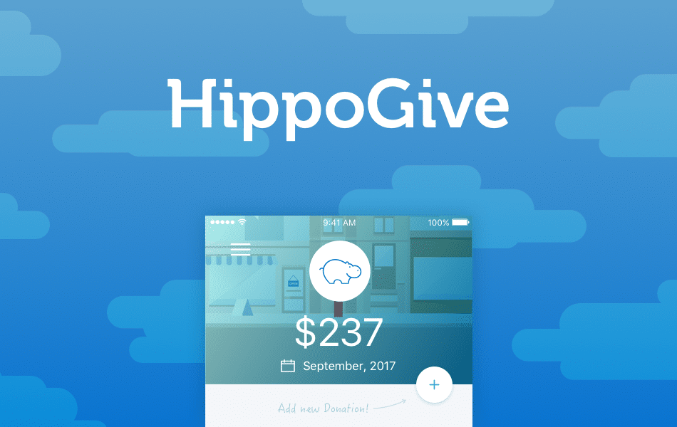
So, what exactly is the magic formula for creating a captivating landing page? As creators of HippoGive, an app that helps you donate your spare change to charities and non-profits, we’ve designed our landing page carefully to ensure that our website traffic converts into app downloads.
Though each seed-stage social venture has different website needs, we’ve broken down the key components of HippoGive’s main landing page to walk you through the basics. Keep reading for our tips and tricks!

Hero Image Block
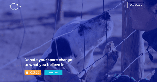
In this circumstance, the hero image block is the image with the dog plus the blue overlay. This is the first impression to potential customers, and must convey the mission of your social venture. Because HippoGive provides users with a donation channel for various charities and non-profits, this image is eye-catching and relatable for users interested in giving back to their communities. Dedicate time to making this image or illustration reflective of your cause!
Call to Action Button
In our case, we want visitors to download HippoGive from the app store, so one of our CTAs is ‘download now’. The ‘enter code’ button leads to a contact form, in order for us to partner with podcasts and build credibility in other mediums.
Think about what action you want your visitors to take when they reach your landing page. If you want them to apply to your program, include an ‘apply today’ button. If you want them to subscribe to your email newsletter, include a “subscribe now” button. Give the primary button a pop of color, and make the secondary CTA button a bit more simple. Be careful not to include too many CTAs and overwhelm visitors.
Who We Are
For mission-driven companies, this tab can narrate the story of your company’s founding and the team that brought it to life. Tell the story of how your founder was inspired by a trip to Thailand, or how they worked out of their parents’ basement for a year before turning a profit. An overwhelming 92% of millennials believe that businesses should be measured by more than profits, so providing this background information can help sell to a key segment of your target market.

Partnerships

HippoGive has partnered with notable organizations like Planned Parenthood and the ACLU, so we want to give those partnerships some prime real estate on our website. Though visitors may not have heard of HippoGive, our partnerships with big names help to build our credibility and reputation. What big names have you previously worked with? Which awards have you won? What organizations are helping to sponsor/fund your entrepreneurial journey? New users will want to read about these accolades before buying into your product or service.

Details
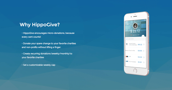
At the top of your landing page, you want your product or service’s description to be short and sweet. As users scroll down your website, you need to provide more insight on how your product or service works. Break down the details into 3-5 succinct bullet points that advertise the main selling points of your offerings.
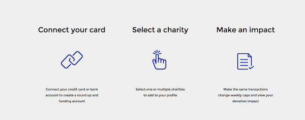
Process
It’s as easy as 1, 2, 3! Users need to be persuaded that your product or service will make their life easier in some way. What better way to do that than to show them the exact process they’ll engage in every time they use HippoGive. No surprises, no hidden steps, and less chances of deleting an app from their phone after a few usages.
Contact
Most importantly, tell users how to get in contact with your team. Whether it’s an email form, a phone number, or a brick and mortar address, your users will feel a more direct connection to your product. This creates a direct pathway for users to inquire about different features or to solicit help when needed. Don’t leave users feeling isolated!
To conclude, your website’s landing page can oftentimes make or break your customer’s user experience. Give it plenty of thought, consult with your tech-savvy friends, and engage in plenty of testing to understand how visitors are enjoying their interaction with your page. The time and energy you invest in this process will be worthwhile in the end!
Start your entrepreneurial journey today.
Related articles about SEED SPOT:
>>“How to Choose the Best Software Development Solution for Your Business”
>>“How to Build an Engaging Landing Page from Start to Finish”